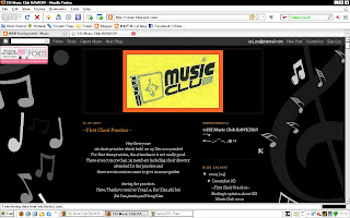
Greetings. This is Chloe, Development Director 09/10. As mentioned in today's meeting, the blog needs a makeover. I've thus far made 3 attempts to beautify it. Previews:
(click to enlarge. sorry, didn't know how to save a pic of the whole page. i'm an idiot in that way.)
So. Which one?
Comments are appreciated. =D Cheers all.


I prefer de 1st one or de 3rd one XP
ReplyDeletede 2nd one look nt so gud
~liping~
1st one look nice ^^ [yenyin]
ReplyDelete3rd design is more lifely.
ReplyDeleteSo I prefer the 3rd one=)
-Shu Ling-
hi=) third1 nicer,more colourful=p
ReplyDeletejiayi= =: up there
ReplyDeletesame with liping=)
ReplyDeleteYantong~
all3 not bad...
ReplyDeletejust the 1st too black, the second if middle can join the line together n 3rd too white...
am i asking for too much??haha
just suggestion...because i do not want black background but if too bright colour can hurts eyes right?? but if i choose i also prefer the 3rd one.XD
lol. wow. thanks for the suggestion =D
ReplyDeletehmm. first one too black... i can change the middle part background colour, but then will look a bit cacat ba... 2nd one the lines can't join together, because the layout memang is fen1 two sides one XD
so... should i try to change the first one first... or should i just straight change to the 3rd one for now?
This comment has been removed by a blog administrator.
ReplyDelete